The NBC Olympics logo is one of the most powerful visual symbols in sports. Its widespread, multi-platform distribution and a lifespan extending well beyond the main events of the Olympic Games ensure that it will make its mark for years to come. The NBC Rio 2016 logo intertwines several crucial elements present in the Games: Energy, Grandeur, Inspiration and Motion.
Three monitor video loop and interactive booth design for Sol Republic at CES 2018 held in Las Vegas Nevada. The video loop features four of the brand’s upcoming releases. The challenge was to create a video long enough to make the loop unnoticeable, on a very aspirational budget. The solution was to create minimal product render moves and build an environment that they live in that we can stretch out (time-wise). Taking cues from the video, we designed a booth that accentuates the tubed lighting and black environment. Please expand video, when playing.
We created five high energy montages highlighting Fox Sports' regional coverage of Major League Baseball. Each spot features one powerhouse team and shows off its current roster of star athletes and beloved mascots.
The campaign design was inspired by the classic offset printing technique found in old-school baseball programs and team flyers. Bold graphics, raw textures, quick edits, and the explosive impact of a home-run hit helped bring this unique sports package together for our friends at FOX.
I redesigned the logo for The NFL Channel’s flagship program, NFL Game Day. I was approached by Trollback + Co. to design the custom logotype. The solution was to merely refresh the existing logo by reducing the amount of serifs, incorporating a more relevant typeface and taking design cues (in this case, angles from the current NFL logo), and introduce them into the design. Alternate logo proposals can be found at the bottom of the page. The Trollback + Co. motion package can be seen here.
Everyone’s jungle is different. How do you avoid the entanglements your jungle creates? How do you break free from the physical and mental restraints that constantly surround you? How do you live free within your jungle without being bound to your device? The Smile Jamaica Wireless Earphone is the solution for your tangle-free lifestyle.
The Smile Jamaica Wireless campaign is House of Marley’s call to action for anyone who cares about our planet Earth! This campaign focuses on these VERY serious questions:
How do you protect the earth?
How do you give back to somethingyou’ve taken so much from?
The tagline, a reinterpretation of our iconic “Superior Sound. Sustainably Crafted” message anchors the campaign by re-enforcing the House of Marley brand philosophy and charitable initiative (see: HousofMarley.com/Project & HouseofMarley.com/Materials)
The campaign imagery is driven by this proverbial jungle, framing the focus on the product. Our talent, traveling through these depths are tangle free as they search for the answer to these questions. The answer — Smile Jamaica Wireless, our new Bluetooth earphone made from sustainable materials.
Credits:
Creative Direction — Joshua Lynne
Photography — Jessica Miller
DP — Zak Mulligan
Stylist — Jenny Haaplaa
BBC Brit is paradise for a certain kind of man.
Where witty banter and madcap adventure meets intellectual substance — all with a healthy sense of the absurd. It's inspired by the things we talk about at the pub: Cars, Science, Adventure, Food, Comedy, Music and Sport.
Brit is the newest member to join the BBC family. Launching worldwide this year. With titles like “Top Gear,” “Bang Goes the Theory” and “Mock the Week” along with personalities such as Louis Theroux, Karl Pilkington and Gordon Ramsay, we sought to highlight the quirky and fun attitude of BBC Brit's programming. The inherent challenge was to make sure that the brand would resonate in a wide range of cultures around the world.
GRAPHIC LANGUAGE
Clean, in-your-face graphics capture the bold and whimsical spirit of the brand with a subtle nod to the Union Jack, that doesn’t become overtly British.
GLYPH SYSTEM
Playing on the idea of a "Bro-Code," we created a system of graphic icons for the different types of BBC Brit programming.
BRIT IDENTS
For Station ID's, we created a system of “Rules of BBC Brit” – quirky ways to live your life. The ID's are copy driven and bold, using two-tone graphic patterns to drive home the ballsy attitude of the brand.
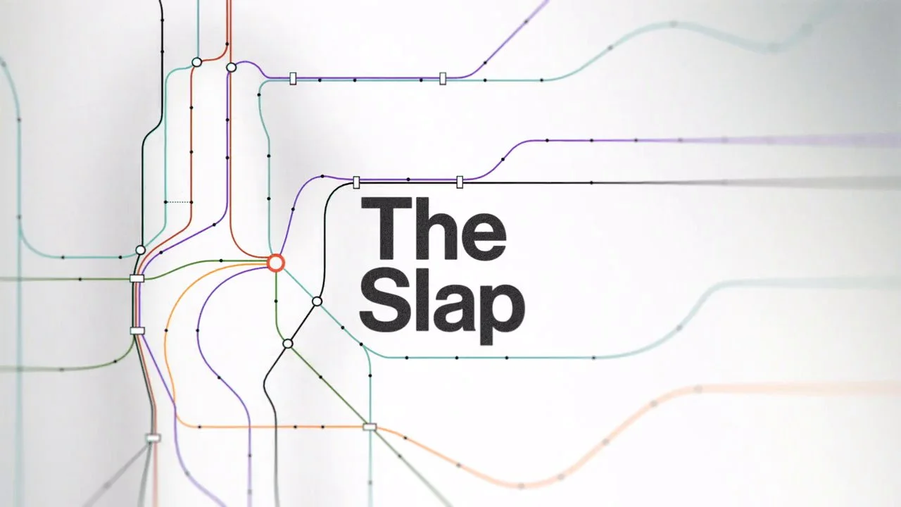
The main title sequence design for NBC's new eight part series called "The Slap". Based on interweaving lines of fate play out in macro forming a hand inspired by palmistry and NYC subway lines.
The entire sequence was created organically in camera, adding motion to motion graphics by projecting graphics onto layers of glass with vinyl stencils at Chris Webb's studio in Red Hook, Brooklyn.
Scroll down to see the Behind-the-Scenes video.
CREDITS
Client — NBC Universal
Agency — Trollback + Co.
Just Add Music! After many years of pioneering the wireless CE space, JAM Audio needed a brand refresh. Aimed at a younger demographic, we redeveloped the product assortment, CMFs, imagery, marketing and social materials and overall brand strategy. What began as a logo refresh turned into a full on overhaul of the brand. We developed a strategy that matched the playfulness of the products and the use cases they are created for. The photography style uses bold color and exaggerated gestures, which made JAM stand out from all the in-situ imagery you’ll find in the CE space. The goal was to accomplish “FUN!” Check mate.
The logo design for CBS's new "The Late Late Show" featuring James Corden and Reggie Watts. James requested we create something non-traditional (with regards to late night logos) that isreflective of Los Angeles, where it is aired. The solution was to incorporate loose hand writen script neon light elements to juxtapose the formal type in the sign. One could say, the “Late Late” neon type is a splash of James into the late night scene.
Scroll down to see alternate explorations.
CREDITS
Client — CBS
Agency — Trollback + Co.
A first for House of Marley, the Stir It Up Turntable is our first step into the record player community by creating the first sustainable turntable. For the release we created a launch video, a materials video and product assets. Working closely with the Marley family and CAA, we also created a limited edition 3x 7” vinyl compilation with 3 Bob Marley tracks, as well as 3 tracks from his sons and grandson. The vinyl records encased 3 of the sustainable materials that were used to build the turntable; bamboo, rewind fabric and FSC® Certified Wood. This launch was well received with massive amounts of press and social buzz.
REJECT PILE ALERT!
I developed some logo designs for my friend Lena's salon... which I quite like (hence me posting them), but unfortunately, were never used. You can see the direction she went with by clicking here.
CREDITS
Client — Lena Ott
I was the lead designer when Trollbäck + Company re-branded The Weather Channel as the world’s most immersive and knowledgeable source of information and inspiration. This marks the network’s first rebrand in 31 years.
We were tasked with re-inventing the information design and creating a modern, exciting image for the network. All the communication, from maps and data visualization to the graphic language and icon system represents a new way to see our relationship with the world around us and further seals the network's authority as the destination for all things weather.
The extensive graphics packaging includes the rebrand of Severe Weather show properties; virtual 3D sets; primetime promo packaging toolkits; a motion control mountain-view time-lapse with typographic lighting; and live-action talent IDs showcasing a deeper view of network personalities.
T+Co also helmed physical set designs to interact with the onscreen graphics; a new tone-of-voice guide with a friendly and respectable tilt; and a sonic identity, working with Man-Made Music, featuring all-new branded anthems, show opens and alerts.
CREDITS
Client — The Weather Channel
Agency — Trollback + Co.
No better way to ring in the new year than creating the branding for the biggest party in Miami. As an antidote to watching people freezing in Times Square, Fox and Den of Thieves commissioned Trollback + Company to turn up the heat for Pitbull's New Year's Revolution with a sexy neon package used on air, on stage and projected onto the walls of the Thompson Hotel.
I designed all the icons to brand each venue as well as a custom font, DALÉ NEON to keep the energy buzzing. Things really heated up when we collaborated with photographer Merlin Bronques from Last Nights Party who added the perfect compliment to the package, setting the tone for the raunchy, hot, Latin fiestá. DALÉ!
CREDITS
Client — Fox / Den of Thieves
Agency — Trollback + Co.
The corporate rebrand if the AMC family of networks which includes AMC, IFC, The Sundance Channel, WeTV and IFC Films.
CREDITS
Client — AMC Networks
Agency — Loyal Kaspar
Album cover art for Emily Haines & The Soft Skeleton. Gold and Black spot color printing with transparent vellum leaflet book.
CREDITS
Client — Emily Haines
Type & Layout — Joshua Lynne
Illustrations — Josh Hassin
A route in a pitch for ESPN's On-Air graphics package for the 2014 FIFA World Cup, utilizing the distinct shapes and colors of a country as a design platform. I designed a custom typeface that we then got embroidered and developed a messaging system based on the texture of a uniform.
CREDITS
Client — ESPN
Agency — Loyal Kaspar
A route in a pitch for ESPN's On-Air graphics package for the 2014 FIFA World Cup, based on mosaic tiles that are so ubiquitous all around the host country.
CREDITS
Client — ESPN
Agency — Loyal Kaspar
A pitch we put together for an exploratory redesign of NFL Network. Me and the team at Trollback + Co, put this together under a very tight timeframe, but it does manage to capture the explosiveness of the NFL.
The rebrand of the pre-movie screeners you see in your local theatre. The goal was to take their current "robot" and give him a new appeal. I also came up with a icon system that is based on the blocks that form the Screen Vision logo.
CREDITS
Client — Screen Vision
Agency — Loyal Kaspar
Creative Director — Elliott Chaffer
Lead Designer — Joshua Lynne
Animator — Anthony Serrano